

Know your trade

Okay, I'll swallow my pride and show you my first ever HTML table-based website. I thought I was so clever with my little menu buttons that changed colour when you rolled over them and my dinky little gif that displayed RSS updates from a range of sources. Since I didn't know what divs were I relied on tables to keep things where I wanted them to be. That they wouldn't show up well on mobile phones never occurred to me. As for CSS, who needed that when I could do all my styling inline. I knew what HTML was, after all. I was messing about with fonts at the time and had no idea how to embed them properly so I just made banners and used those. I had no real grasp of white space as a concept, either.
Find and follow professional designers

Make a playground to fool around in
I use free web hosting services mostly because I don't have to worry about the hosting lapsing; as long as I hop in from time to time it won't. 000Webhost is a particularly good one, it's where my comics are hosted since Google doesn't give me the space I need to really get down and dirty. You don't really need hosting if you're not using CMS (which requires a database), though. Your own PC can store and display any kind of file.
Get a decent code editor and learn to code!

There are some great tutorials here, here, and here. Dig around a bit and see what else you can find. Don't be fooled into thinking that you simply MUST have the Adobe Creative Suite; I get along perfectly well without it using free alternatives. Check your finished code against the W3C Markup Validation Service to ensure your design is compliant with web standards.
Yes, I know this one wouldn't pass muster (blame Google/Blogger for that, I can't do much about the markup) and neither would many CMS but if you're building from scratch you can indeed make it compliant with web standards. At least put alt tags on your images (in Blogger click on the image, then Properties, then fill in the blanks. I must confess I don't always remember to do it and it doesn't prompt you. This helps with accessibility.
Learn to write code, at least in HTML and CSS (if not PHP or JavaScript) before you start looking at CMS (content management systems). That way, you'll understand what they are and how they work before you use them for website building. Yes, it's easier than painstaking hand-coding because WordPress, etc., does all that for you. The trouble is, PHP tends to have certain vulnerabilities and the programmers who design the themes don't always consider. Don't get me started on premium themes. This is WHY I hold the opinions I do; I know and understand what's under the bonnet, and ideally, if you want to be a proper web designer, not some flashy wannabe, this is what you do.
Remember mobile
The current trend for mobile-first websites (I'm not a fan, they look too big and clunky on a PC screen) is due to the fact that increasing numbers of people are viewing websites on mobile devices. Whether you like it or not you're going to have to take mobiles into consideration and design for them. Follow web design magazines on Twitter and read the articles linked in their tweets; they will often lead to tutorials for different options for designing for mobile. These are typically a) a mobile version of your site (Con: it may duplicate your content and may cost you in the search results), b) responsive — changes size with your screen. My preferred option, but making breakpoints for resizing images can be onerous. Workaround: keep 'em all small by default as a rule. This isn't always possible, though, particularly if you're using a slider. c) Mobile-first — huge images and text that show up nicely on mobile phones. The clue is in the name; it's not so nice on a PC screen. d) Adaptive design — somewhat like responsive, it's about detecting the device being used. This is about the rendering engine (I did say "learn to code!") being used by the browser; the main ones are Gecko (Firefox) and Webkit (Chrome).
Generally speaking, the simpler your code, the easier it will render on different browsers and the better the website will look. Use a browser tester to show you what your site will look like on other browsers than the one you're using. Check it out at different screen sizes using mobile emulators. They will help you to decide what's best for your site. Personally, I believe in keeping it simple as you can't always predict the size of mobile device screens, they haven't been standardised as such. I tend to favour a more fluid approach where stacked columns slide beneath each other on the front page mostly because it's an easily digestible way of displaying information that works perfectly well on mobile as they'll stack beneath each other in neat little blocks. Remember to pack as much information in as possible while keeping the actual volume thereof short and sweet. Colours, fonts, and images count as content as they help to get the message across.
Content is king
I've often had clients ask me to design a website that looks like a particular one that they like. It turned out to be a waste of time trying to explain what the problem with this is, namely that it's not the shape of the clever little boxes or the way the pictures change when you roll the mouse over them that makes the site look good, it's the quality of the images and text. You know, the content. Wannabes miss this all the time then wonder where they went wrong. The trick is not to start with an idea of what the site is going to look like just because you've seen a nice one on the internet. You need to build from the content out and that starts with two things: the mission and the message.
The mission: what the purpose of the site is. My old web design site's mission was to showcase my design skills in as many ways as possible in the fewest pages in the smallest space. I wanted to prove I could do anything for anyone, whatever they wanted. To that end I initially set up some static pages and tacked on a blog and a gallery, then made the CMS look as similar as possible to the static pages, even though they were different programs from different developers. That was actually the point.
My old website's message was, "I'm a multi-skilled talented web designer who can provide for all your web design needs via my one-stop sort-it-all-out shop. I'll make your logo, sort out hosting and domains, get your site online, then help you out with social media, advising on the best way to engage with your target audience."
Got that? You base your design around your mission and your message. If you want to design and sell merchandise you most likely need an e-commerce platform to display and sell it from. If you're a photographer, you need a gallery to showcase your work. If you're a florist or a wedding planner or... whatever, and all you want to do is provide information about what you do, a static site may suffice but CMS like WordPress or Blogger provide the opportunity for the clients to update information themselves and provide news items for their audiences. You need to regularly refresh your content in order to remain relevant so CMS is usually the best way to do things.
Layout, etc.
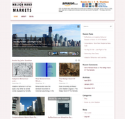 Once you have decided what your mission and message are, you're good to go. In this design, the mission was to sell this author's books and to promote him as a feature writer for serious magazines. After some considerable discussion (he's one of my favourite clients) we agreed that the mesage would actually be about promoting his article writing, then his other books. To that end he has a slideshow at the top for his articles, a carousel beneath it for his books, and a featured articles section beneath that. At the top is a link to his Amazon author's account where you can buy his books. That paid for Christmas 2012.
Perspective differs also in that the client provided her own logo and insisted on the image and colours used. The customer is always right, so I didn't argue, I just did my best to make it look good.
This website, On t'Internet, is a straightforward, no messing about blog. I chose a standard two column layout because that is sufficient for my needs. Note that I've kept the Eye for Design logo; I like to keep my hand in and still do the odd bit of design for friends so I wanted to retain the association with my former trade. I've kept it simple so the focus is on my writing, not the cleverness or prettiness of the actual design. The right-hand column I use to showcase links and adverts for my stuff and for sponsors.
Contrary to conventional wisdom design is not about being pretty or clever, it's about getting the mission accomplished and the message across in the most effective way. If your website does that, job done. As I've already said, you don't need to buy expensive software to become a web designer, you just need to be willing to know what the rules are, how to code, and what the various options are for displaying it on a range of devices.
This article is not a definitive guide, it's a finger pointing in the general direction of web design for beginners and tells you a bit about what's involved. You really need to find out more, preferably from the professionals at the top of their game. Alas, I never got to be that good and now I work in a facilities management call centre. But dang, it was fun while it lasted. Check out the gallery and comics to see what I could do using open source software. Good luck.
No comments:
Post a Comment